
Clusters of Stacked Bar Charts
Tis the season to visualize election polling data!
Today I sent in my absentee ballot (howdy, Texas) and set up a module to chart survey results based on respondent demographic data.
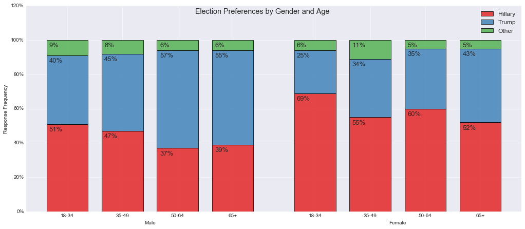
In particular, let’s make a chart with Python’s matplotlib plotting library to see – which candidate are each gender and each age group leaning towards? The module has got other applications, so I thought I’d share it here.
Its purpose is to be an out-of-the-box solution. Pass in a Pandas data object and the segments you wish to group by (i.e. columns in the dataframe), et voila!
clustered_stacked_chart.plot(electiondata,
                             my_two_segments=['Gender','Age'],
                             title = "Election Preferences by Gender and Age")
Find the GitHub source code here.
And the Data Source here:

October 29, 2016